When to introduce a client to an artwork concept for a project is always tricky.
Do you put your ideas on the table at the first concept presentation? Well, ideally yes.
But when there are big macro issues to be resolved like where to place risers in a building or how to comply with building codes, you’re not going to get the focus on artwork you’re looking for.
This may seem like an odd topic for comment but it is one of greatest frustrations because if you don’t get the moment right to talk about the all-important art, the money has run out due to an over-spend on the aforementioned elements that frankly the end-user doesn’t care about.
Very often I introduce an art concept as an integral part of an interior concept and try to make it non optional. To do this I often create a narrative which has local relevance either because of the subject matter or the artist themselves. I strive to get the art written into the budget from the get go, along with the furniture and finishes.
Unfortunately, it doesn’t always work because the art is quarantined as if it’s part of the styling to be tackled as the very last task on completion of the building works.
The trick is to try and get the client to engage by suggesting a trip to the artist’s studio or representing gallery, by mentioning discerning collectors who have works by them or other enlightened institutions or developers who have created similar installations and won accolades for doing so.
I might also ask an art consultant to put together a prop based on my brief, just enough to whet the clients appetite but not enough to give away intellectual property.
And when a client has neither an interest in art or the money to spend on anything decent, we go into creative overdrive and, using artisans and materials sourced globally and the help of friendly suppliers, create unique decorate elements that add that wow factor that we’ve come to expect from clever interiors.
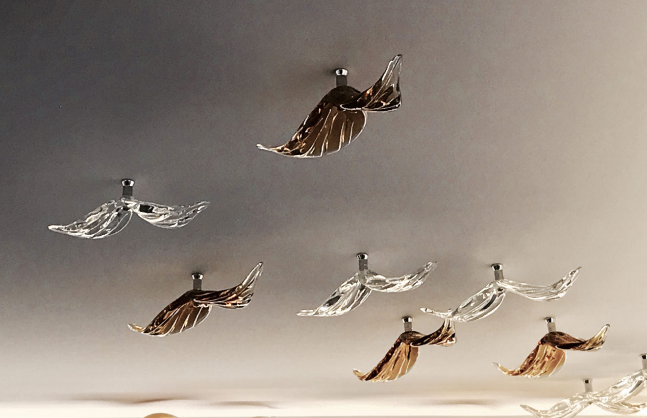
A recent example of that was a flock of glass birds we applied to a ceiling coffer in a reception lounge. We had two massive crates of these simple bird sculptures made by a helpful lighting manufacturer. I climbed a ladder the day before the building was officially opened and marked the ceiling in pencil with the formation. I thought the flock would most make flying out from one corner of the room. Backlit by the ceiling downlights the result was sparkly and beautiful.


